Published on
April 17, 2014
Category
Features

Originally published on FACT.
We’re all familiar with the great cover art masters – the Savilles, the Olivers, the Hipgnosises.
For sure, the flair and visual confidence of the above mean their works still leap out from an increasingly packed crowd. That said, there’s no deficit of stunning contemporary artwork doing the rounds – and, by that token, more than a few contemporary artists building exceptional bodies of work.
FACT spoke to eleven of our favourite artist and designers currently working today. Alongside scroll-through galleries of some of their output, we’ve also spoken to each about their working practice, motivations and inspirations.
We’ve deliberately tried to reflect a broad range of practice. Some portfolios stretch back three decades; some are slim but impeccable. Artists in the classic sense are included, but we’ve also got in touch with in-house designers, whose font and formatting work have helped build a distinctive label aesthetic. And a good handful are producers themselves, able to approach the task from a music-maker’s perspective.
Plenty more could have featured, of course: hat tip to Will Bankhead, Jeff Jank, Bok Bok and the Night Slugs team, Stephen O’ Malley, Ben Drury, the Ghost Box team, the Check Morris agency, Claude Eden, our own Alex Solman (responsible for our FACT Mix illustrations), and more. But for now, here are some of the very best.
Robert Beatty
Gallery: Robert Beatty’s best sleeves
Beatty plays with noise unit Hair Police, and records solo as Three Legged Race – and his design work shares more with the sploshy electronics of the latter than the fury of the former. The Kentucky artist’s illustrations tend to be wonderfully fluid – plumes of colour bursting from spheres or pipes, Daliesque drips and wobbles, gnomic symbols placed in juxtaposition. The giddiness and vibrancy is often reminiscent of Storm Thorgersons’ more fevered designs – and Beatty himself points to the technicolour eye-blitzes of Takeshi Murata, whose work he recently soundtracked, as inspiration.
How would you describe your aesthetic?
Present warped through the past’s vision of the future scraped from the bottom of a garbage can, cleaned up, and chromed for presentation/preservation.
What interests you in particular about producing visual work for records?
It’s always a nice challenge to come up with something that works with the music on a record and that will stand out among the dozens (maybe hundreds?) of other records that are coming out any given week a record I work on comes out.
What are the big no-nos in your practice – things you studiously try to avoid?
I try at all costs to avoid repeating myself.
Which other artists – visual or otherwise – inspire you?
Always too many to mention in one breath, but lately it’s been Antonio Dias, Mark Leckey, Lygia Pape, Lillian Schwartz, Chris Burden, Ken Price, Jane Arden, R.B. Kitaj, Steven Claydon, Jan Lebenstein, Maurizio Cattelan & Pierpaolo Ferrari, tons more.
Which sleeve would you pick as the best introduction to your work?
Probably whatever the latest one I’ve done is.
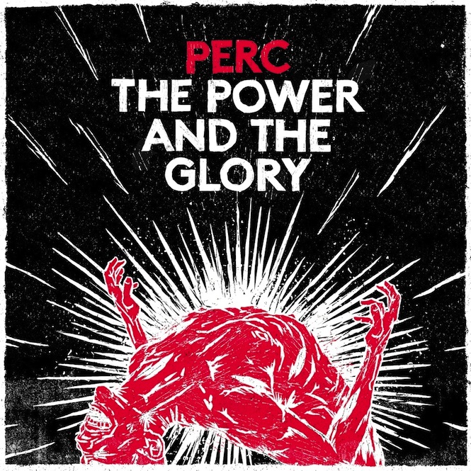
Jonny Costello
Gallery: Jonny Costello’s best sleeves
Costello’s main paymasters, Fluid, have designed covers for the likes of One Direction and Dappy – but he’s not here for services to chart pap. His own Adult Art Club studio is proving itself a dab hand at producing artwork for the gritty techno types orbiting around the Perc Trax label. Costello’s work captures the dread of Truss, Forward Strategy Group et al, without going doing the gunmetal wash/leather glove route; his recent work for the Submit label is particularly arresting.
How would you describe your aesthetic?
Aesthetically speaking, I try and approach each job afresh, matching the aesthetic to the visual message I’m trying to convey. Overall, I would like to say the body of my work has a very real feel, using a lot of natural textures and elements, to add a human feel to it. I like challenging pieces of artwork. Challenging artworks make a lasting impression. A wry beauty that touches a chord is far more powerful that a fake perfection that can be so easily produced.
What interests you in particular about producing visual work for records?
The freedom and scope it offers, and there is no one right or wrong visual solution. Independent record sleeve design is one of the last great unrestricted creative outlets – for designers, this is a very appealing draw. I also like working with musicians and find the working process can be quite rewarding.
What are the big no-nos in your practice – things you studiously try to avoid?
In my practice, I try to avoid the standard trapped-out clichés, unless they are to prove a bigger point, or its used in an ironic fashion. Too many techno records have grey decaying buildings on them and men in gasmasks. Too many hip hop records have lens flares and bling. There are certain visual elements that get twinned with styles of music, and you want to be at a low ebb in your creativity to cart them out. Never resort to putting scantly clad members of the fairer sex on your record sleeve. It’s never looked good and it never will. With the exception of Grace Jones – she could pull it off.
Which other artists – visual or otherwise – inspire you?
The list is endless, and inspiration comes from everywhere, not just artists. A quick list off the top of my head of of people that I keep coming back to in some way, shape or form would be Gerhard Richter, Jake & Dinos Chapman & the DDS crew all for different and unique reasons. 50 Cent and Mike Skinner have some great thought perspectives on the creative process. Bill Drummond form the KLF is pretty inspirational. I’ve been stalking him around Birmingham the last month as he’s here on an artist’s residency – I’ve not asked about the money yet. He’s got some great stories though. On a more personal level, its important to have good inspirational people around you as well – Lee Basford, Charlotte Audery Owen Meehan & Karl Toomey are some close art director friends that I always find their work and view point inspirational.
Which sleeve would you pick as the best introduction to your work?
The new Perc album, The Power and The Glory, was a sleeve that went against the grain with what was going on visually in that area. It was pretty raw and I feel it was quite strong. The artwork was a brutal and naively rendered lino cut which reflected a direct expression of the underlying theme of the album. Working with Perc is always visually rewarding. This isn’t the style for the majority of my work but it just fitted for this sleeve in particular.
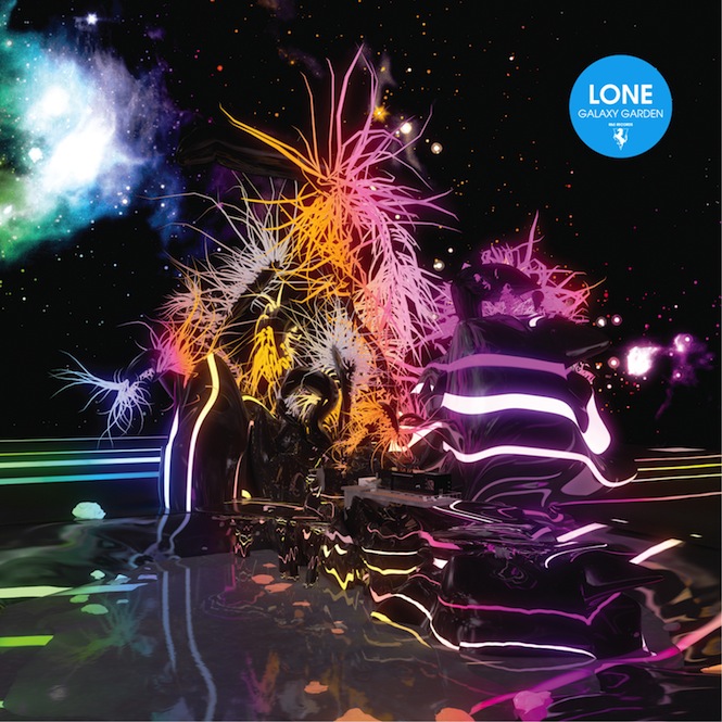
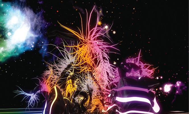
Tom Scholefield (Konx-Om-Pax)
Gallery: Konx-Om-Pax’s best sleeves
Tom ‘Konx-Om-Pax’ Scholefield – the name’s swiped from an Alesteir Crowley book, incidentally – has long been making proper inroads as a producer (see Regional Surrealism, his 2012 collection of elliptical electronic sketches for Planet Mu). Still, his day job is proving increasingly successful, with his lucent, ultra-synthetic designs cropping up all over the shop. Like clearly attracts like: Lone, Hudson Mohawke and Rustie have all used his designs to compliment their glossier-than-thou productions.
How would you describe your aesthetic?
Hyperrealism, Ultra Vivid, Rave Inspired, DMT Soaked. Abstract Reflections.
What interests you in particular about producing visual work for records?
First of all, I’m a total music geek/nerd whatever you want to call it. It’s my first and only love at the moment. I like the challenge of trying to represent the music in a visual way. I’ve been lucky enough to work with some of my favourite musicians so its been relatively easy to come up with aesthetics for their music. Generally, when you’re in a record shop, the sleeve is the first thing you experience, so it has to be attention grabbing. I tend to go for the high impact WTF type designs.
What are the big no-nos in your practice – things you studiously try to avoid?
I try not to repeat myself. Or go for the obvious idea, or what’s trendy at the moment. I try pull an idea out of the leftfield. Also spending too much time on something can ruin the initial idea. I like to bang out a rough version as quickly as possible, much like a music demo, to see how it fits, then work it up.
Which other artists – visual or otherwise – inspire you?
The big ones for me in no particular order: HR Giger, Francis Bacon, Stanley Kubrick, Herzog, Hudson Mohawke, Rustie, Oneohtrix Point Never, Trevor Jackson, Ridley Scott, Team Doyobi, AFX, AE, Alex Rutterford, Chris Cunningham, Bernard Parmegiani (RIP)
Which sleeve would you pick as the best introduction to your work?
Hmmm…not sure. Maybe go for Lone’s Galaxy Garden. It’s my recent favourite. It’s the tastiest looking one I’ve ever done.
Kim Hiorthøy
Gallery: Kim Hiorthoy’s best sleeves
The Norwegian designer and musician is about two decades deep into his career, and the lion’s share of his best work has turned up on jazz/experimental label Rune Grammofon. His bright, abstract images – maroon snozzcumbers; technicolour avalanches; a ruby-red torus, set alight – are instantly recognisable, whereas sleeves for the likes of Maja Ratkje and MoHa! have shown a more twisted side. And his comparatively sharp photographic designs for Smalltown Supersound show a man with an excellent string:bow ratio.
How would you describe your aesthetic?
Finding it difficult not to be flippant here. Which, I suppose, is because I don’t like to think about what it might be or admit to having one. It feels a bit like being asked to describe your personality. Sorry, I don’t know what to answer. (‘Post-erotic’? ‘Conceptually impaired’? ‘Unfortunate’?)
What interests you in particular about producing visual work for records?
Doing something that is attached to music, but at the same time is something completely different from it. The degree of insignificance the packaging has compared to the music. The meaning of (some) records in (some) people’s lives. Making a cheap and mass-produced object look potentially weird and different and unlikely.
What are the big no-nos in your practice – things you studiously try to avoid?
I don’t think I have no-nos. I do try not to repeat myself, but I don’t know how studiously I try it. If I tried studiously enough, I’d never be able to finish anything.
Which other artists – visual or otherwise – inspire you?
So many; three off the top of my head right now would maybe be Mica Levi and John Baldessari and Agnes Martin?
Which sleeve would you pick as the best introduction to your work?
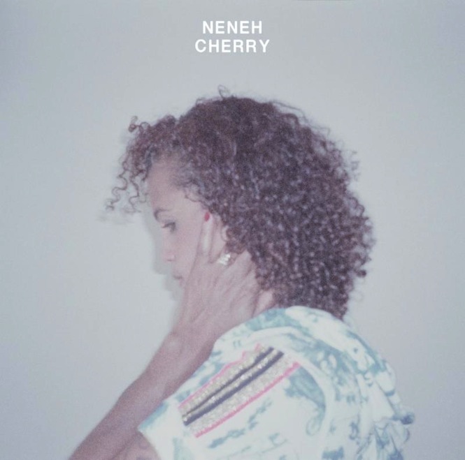
One of the last ones I did was for the new record by Neneh Cherry. It doesn’t look too much like other sleeves I’ve done, which hopefully makes it as good a place as any.
David Packe
Gallery: David Packe’s best sleeves
Illustrator Packe, who trades as Gerbil Tea, is the chap behind Old Apparatus’ stunning run of 2011-13 releases – arguably the most gorgeous run of sleeve designs from an emerging artist in recent years. From the mangled Victoriana of the group’s first Deep Medi releases to the meticulous illustrations that adorned their 2012 EP series, his work has done much to cultivate OA’s air of mystique; his catalogue’s not exactly heaving at the moment, but it points towards a fine career as a cover art pen-to-hire, should he wish to take it.
How would you describe your aesthetic?
I’ve always been interested in scientific imagery, especially looking at extreme scales – whether it’s viewing the universe through a telescope, a slide through a microscope, or when you move beyond what is visible with today’s technology. That’s when things start to blow your mind. A lot of inspiration is taken from natural curiosities that are alien or unfamiliar to everyday life. They can can be unsettling and beautiful. When creating an image, I might bring together star clusters, supernovae, diagrams of autopsies, animals, plant life and machinery, and then by scaling these elements disproportionately I can start to form landscapes and compositions that bring together the strange worlds of the very big with the very small.
What interests you in particular about producing visual work for records?
The type of relationship that I enjoy the most with musicians is the symbiotic kind where your ideas feed of each other. I think it can be more interesting to be a part of the creative process rather than a response to it. For Old Apparatus, we never thought about any one record sleeve in isolation – it was more about how we could create a unique landscape where the sleeves were just moments of time within that world. The great thing about working within a bigger idea is that there is so much room to evolve. It’s like the deeper you get into it, the more you want to enrich the overall sensory experience.
What are the big no-nos in your practice – things you studiously try to avoid?
I think that for Old Apparatus integrity is really important. We all started out as independent artists doing our own thing, hanging out in Leytonstone, East London, where we all met and became friends. When the idea of a collaborative project came together, we all jumped on it, determined to establish our own creative space where we could share and develop ideas. When it became more than we could have imagined and we started to release records, it was a really exciting time. We were always looking at how we could push things forward forward but always had an uncompromising vision.
Which other artists – visual or otherwise – inspire you?
I get a lot of inspiration from outsider artists on the fringes of society where art is a form of therapy or a reaction to deep and personal emotion. Artists such as Charles Dellschau, Henry Darger, Adolf Wölfli and Madge Gill all produced incredibly imaginative and extensive works that are highly detailed and thought provoking interpretations of their inner minds.
Which sleeve would you pick as the best introduction to your work?
The first sleeve that I produced was for the self titled Old Apparatus EP released on Deep Medi. We wanted to produce a bold, striking image that had fantastic tactile qualities. We silk screen printed a limited number in black and metallic silver on this really nice brown board stock. I love exploring new print techniques, but there’s still so much to learn.
Steve Byram
Gallery: Steve Byram’s best sleeves
Byram’s main stock-in-trade are his lovely, straight-to-corrugated-card illustrations for the jazz-leaning Screwgun imprint – scratchy stencils and sketches, full of heart and authenticity. It’s a joy, then, to discover that the New York fine artist is also the man behind some of Def Jam’s bolshiest 1980s classics: LL Cool J’s Radio; Slayer’s Reign In Blood; and one of most unfuckable-with rap covers of all-time, Beastie Boys’ Licensed To Ill. A veteran and a trooper.
How would you describe your aesthetic?
I would describe my aesthetic as an extrapolation of dada mixed with a strong desire to plug into the spontaneity of folk art.
What interests you in particular about producing visual work for records?
Music is the most constant, deepest and compelling source of inspiration I’ve ever experienced. It never fails to send me somewhere or nudge me towards something I can create with, and it never lets me catch up with it (thank god)
What are the big no-nos in your practice – things you studiously try to avoid?
I try to not jump to a conclusion too quickly, I try to avoid going forward when I should be backing up and I try not to get discouraged.
Which other artists – visual or otherwise – inspire you?
At the moment and in no specific order: Martin Puryear (sculptor), Samuel Mockbee (architect), Jay DeFeo (painter), Cal Schenkel (artist/designer), Bill Traylor (artist) Jonathon Rosen (artist/animator/designer), the Brothers Quay (film makers) Charles Burnett (film maker), Hannah Höch (artist), Jennifer Egan (writer), Tim Berne (musician), David Torn (musician), Mike Formanek (musician), Lara Bello (musician), Martin Newell (musician), Silvia Perez Cruz & Raul Fernandez Miro (musicians) and Dan Nicols (musician).
Which sleeve would you pick as the best introduction to your work?
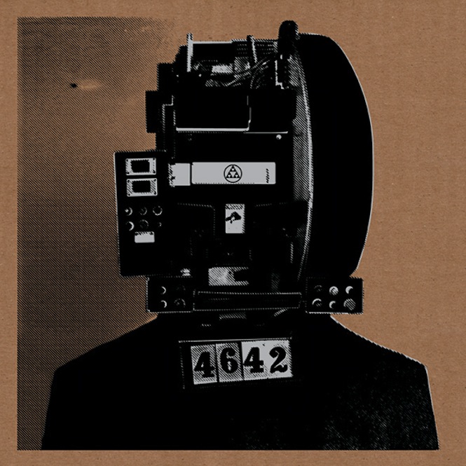
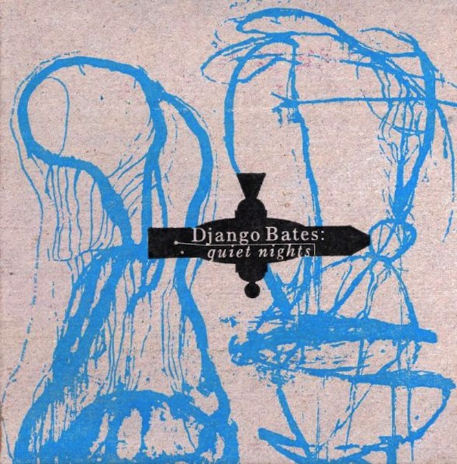
Today, that would be either Big Satan’s Live Incognito or Django Bates’ Quiet Nights. Next week, who the fuck knows.
Manuel Sepulveda (Optigram)
Gallery: Optigram’s best sleeves
Sepulveda – who trades as Optigram – isn’t quite an in-houser at Hyperdub, but he’s certainly done more than any to shape the art direction of the label over the last half-decade, and Warp, Planet Mu, Public Information and Bleep have also all come knocking. Although he’s most readily associated with dark, blocky images, his catalogue contains light and shade – peep the lovely sino-stylings of Black Sun, or the Rorschach feel of his excellent Traxman covers.
How would you describe your aesthetic?
I was thinking about this a while ago when a friend asked the same question, and even though my artwork ranges from geometry and patterns to science fiction and camouflage, I think there’s a common sense of things having a kind of rhythm. A lot of the images seem to have something emanating or flowing from a certain point. That must inevitably come from the fact that most of my work revolves around music. And obviously a lot of my stuff has a retro-futurist vibe, which I can’t help because I grew up in the ’80s – that decade is like a whirlpool that I’m forever trying to swim out of.
What interests you in particular about producing visual work for records?
Simply the fact that it’s part of something more than just the image on its own. I almost never collaborate with other illustrators or designers but I do like the feeling of music and artwork going hand in hand and that sense of them both complementing each other. It’s also very liberating to be inspired by music rather than by something visual. Plus, working for record labels in general gives you a lot more freedom compared to working for other industries where marketing considerations and too many people’s feedback can end up forcing compromises on the work.
What are the big no-nos in your practice – things you studiously try to avoid?
I don’t like feeling like I’ve been subconsciously influenced by other designers who are currently working in similar areas to me, so I try to avoid looking at online portfolios or design and illustration websites. I mean, it’s inevitable that I’ll come across new work from other designers, and I like to support friends who I think are doing good work. But generally I don’t think researching current design work is helpful to me developing my own ideas. I prefer to draw inspiration from other areas and eras. Also, I don’t like to repeat myself too much. A lot of artists and designers make excellent careers for themselves by doing work that evolves only very gradually, but I don’t have the patience or focus for that kind of gradual progression and tend to jump around a lot more. I’d rather be inconsistent than predictable.
Which other artists – visual or otherwise – inspire you?
Just looking behind me at my bookcase and picking things at random – the architectural paintings of Zaha Hadid, the science photography of Berenice Abbott, the op art of Bridget Riley, the paintings of Josef Albers, the comic book art of José Muñoz, the work of the British Vorticists, the graphic design of Tanaka Ikko. But also experimental film, modern architecture, innovations in technology and science… anything really. Someone might be wearing a jacket and the way the fabric has folded and created shadows might give me an idea for a pattern. My phone is full of random photos. Beyond that, nature has a tendency to be really visually astounding and make you realise that you offer it no competition.
Which sleeve would you pick as the best introduction to your work?
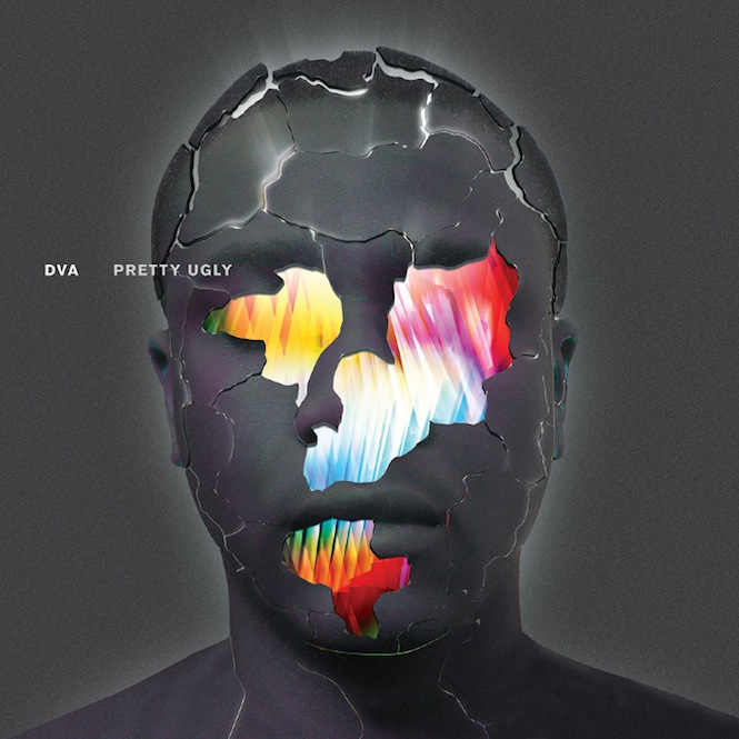
Probably the DVA Pretty Ugly sleeve, as that got a good reaction from people when it was first announced. It combines my abstract pattern style with the more sci-fi illustration vibe that I sometimes do. So I guess if you don’t like that then you probably won’t like anything else!
Zeke Clough
Gallery: Zeke Clough’s best sleeves
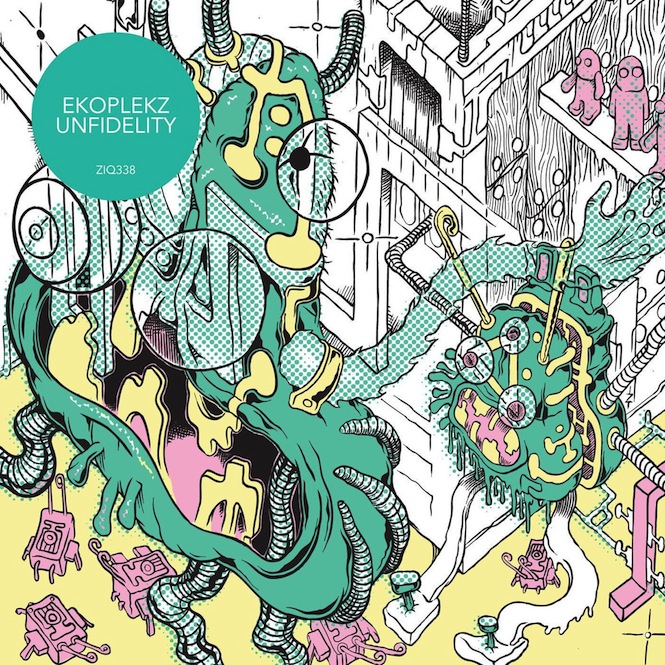
Could Skull Disco have captured quite so many hearts and minds without Zeke Clough’s accompanying artwork? A schoolfriend of Shackleton, Clough’s staggeringly detailed drawings of hellscapes, sarcophagi and torture chambers belong to an established tradition of heavy metal art – imagine R. Crumb scribbling for Mayhem – but in an electronic music context, they stick out like a skewered thumb. His collaborations with Shackleton have continued to impress, as has recent work with The Bug and Ekoplekz.
How would you describe your aesthetic?
A laser-etched view of a neurotic future, in which denizens of a hive mind compete mercilessly for crumbs of humanity (i.e. social media in 50 years time)
What interests you in particular about producing visual work for records?
I like art that is functional, so record sleeves fit into this – they ideally become a small part of daily life. Also, I’ve loved music since I don’t remember when, and it’s fun to try and visualise the sounds, or reflect an aspect of them at least.
What are the big no-nos in your practice – things you studiously try to avoid?
Repetition, creating a look for a certain label, then repeating it for someone else. It’s a challenge to constantly change styles with each project, but I think essential. Would hate to just repeat past images endlessly.
Which other artists – visual or otherwise – inspire you?
So many…I like many Japanese artists from the Ukiyo-e period, more modern Japanese artists, King Terry, Hideshi Hino, Takashi Nemoto. Artists on the fringe of surrealism such as Roberto Matta and Brion Gysin. American artists such as Jack Kirby, Gary Panter, Jack Cole and old kid’s comics from the ’50s. Also, I’m interested in how musicians and artists that grew up in the ’70s and ’80s are now interpreting ‘the future’, the way those past futurist impulses have been digested and are being regurgitated with current technology.
Which sleeve would you pick as the best introduction to your work?
The sleeve I did for Ekoplekz’s Planet Mu album, Unfidelity, I would say best represents my current approach.
Will Work For Good
Gallery: Will Work For Good’s best sleeves
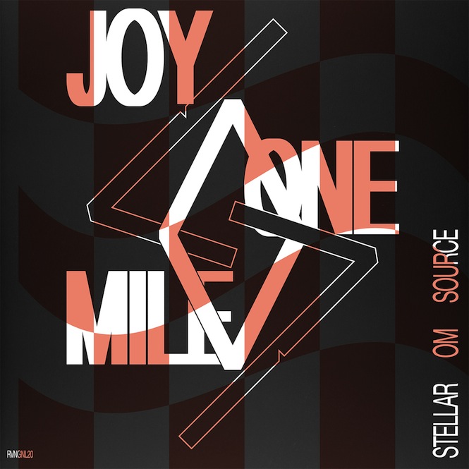
Based out of Brooklyn, Will Work For Good’s designs don’t exactly throttle your optic nerve: muted colour washes, clear typography and a general air of delicacy tend to be the order of the day. That softly-softly approach has worked a treat for RVNG Intl, whose releases – Sensations’ Fix, Julia Holter and Stellar OM Source among them – have been lent a wonderful sense of coherence, and whose FRKWYS collaboration series has been enlivened no end by WWFG’s designs.
How would you describe your aesthetic?
Small, slow
What interests you in particular about producing visual work for records?
Matt Werth/Rvng Intl., Matthew Higgs/White Columns
What are the big no-nos in your practice—things you studiously try to avoid?
Poverty, meat
Which other artists—visual or otherwise—inspire you?
Ken Saro-Wiwa, Peter Fend
Which sleeve would you pick as the best introduction to your work?
Stellar Om Source (RVNGNL19, RVNGNL20)
Bill Kouligas and Kathryn Politis
Gallery: Bill Kouligas and Kathryn Politis’ best sleeves
Steward of the ever-venturesome PAN label, Bill Kouligas – working with longtime collaborator Kathryn Politis – has build a strong visual identity under which to yoke his motley stable of noisemakers, collagists and, increasingly, club producers. Whether presenting photographs nicked with intersecting lines or coloured shapes in consort, there’s normally a geometric bent to the pair’s work, the play of circle and angels.
How would you describe your aesthetic?
Palladium at night.
What interests you in particular about producing visual work for records?
Context. We have been collecting records and publications, and otherwise involved in music, since a young age. The main focus is always the why and how things happen and interact with each other.
What are the big no-nos in your practice – things you studiously try to avoid?
I guess the main one would be boredom. We tend to filter new information constantly and continually develop ideas. We started through a very different angle and perspective back in 2008 than now, but its necessary to find the fine line to what interests us and give it a continuous push
Which other artists – visual or otherwise – inspire you?
Ralph Macchio. Recalling the master on the artwork of the forthcoming Beneath EP.
Which sleeve would you pick as the best introduction to your work?
Hard to say, as it’s always collaborative with the artists themselves or based on the concept of each individual release. If I had to pick some it would be Helm’s Impossible Symmetry LP (PAN 27), or both Jar Moff releases (PAN 31/PAN 49). I felt the combinations of typography, geometric designs and photography were nicely balanced and arranged.
David Correll
Gallery: David Correll’s best sleeves
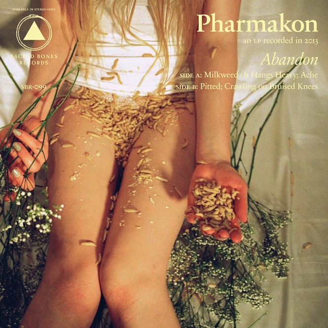
More than any other contemporary label we can think of, Sacred Bones have done a brilliant job of making their various releases feel like cards in the same pack. That’s largely been down to their resident art director David Correll, whose formal typography and elegant design has served as a constant over seven-odd years of releases. The artwork might range from ice trolls to bare legs covered in maggots, but Correll’s input stresses the importance of a designer’s hand in turning a scattershot discography into a cogent body of work.
How would you describe your aesthetic?
It varies a bit depending on the record, but the Sacred Bones aesthetic is often inspired by a mixing of old and new imagery – like dusty, old wood-cuts, against a mid-century modern aesthetic.
What interests you in particular about producing visual work for records?
Design for record sleeves is what got me interested in design from the beginning. It’s such an emotional, immediate way to communicate. And you can get away with a lot more than you can with more corporate design.
What are the big no-nos in your practice – things you studiously try to avoid?
Things I try to avoid? Typos. We’ve had a few.
Which other artists – visual or otherwise – inspire you?
Well, my personal big three of record-sleeve design are of course Peter Saville, Mark Farrow, and Vaughan Oliver. Early in my career, I had the privilege of working with both Gelman of Design Machine, and JP and Allison Williams of design:mw, and I learned immeasurable amounts from all of them. Outside of that, I find inspiration everywhere from mid-century architecture like the Case Study houses, to early botanical and medical illustrations, to film directors like Kubrick and Bergman, to random conversations with bartenders.
Which sleeve would you pick as the best introduction to your work?
I love Pharmakon’s Abandon, with the juxtaposition of beautiful and disgusting. I was so inspired by Jane Chardiet’s fantastic photograph for that. (Their descriptions of that photo-shoot is the stuff of nightmares.) Most representative of any sort of “Sacred Bones look” would be any of LPs, but maybe mostly the Todo Muere compilations we’ve done for Record Store Day. Other than that, my personal favorites are probably The Cultural Decay’s 8 Ways to Start a Day and the Eraserhead reissue.
Sign up to our weekly newsletter
Never miss a thing