Published on
July 19, 2016
Category
Features
Mixing seventies sleaze, goofy humour, hand-lettering, and a touch of psychedelia, Todd Terje has one of the most striking visual aesthetics on record. We profile the Norwegian genius behind his sleeves.
Words: Emma Tucker
Norwegian illustrator Bendik Kaltenborn’s hand-drawn lettering and quirky characters have adorned sleeves and posters for the likes of Norwegian jazz trio Listen, British band Chicken Lips and composer Daniel Herskedal. Drawing on a life-long love of comic books, the artist creates a cast of characters that exist in a bright and angular world that’s miles away from the status quo of Marvel or DC Comics.
However it’s Kaltenborn’s collaboration with Norwegian DJ and producer Todd Terje that helped springboard the illustrator into sleeve design, and has catalysed a creative partnership between the pair that’s produced one of the most recognisable visual identities in music today.
The pair started working together 14 years ago, after an encounter in a record store. Kaltenborn was involved with comic fanzines, and the duo bonded over a shared interest in the world of “stupid humour and comics”. The musician’s first EP was a chance for Kaltenborn to indulge a long-held desire to work on a 12” sleeve design.
“For me, as a person who can’t play any instrument but is hugely into music, it’s a way to somehow stick my nose in to play a small part in music,” says Kaltenborn, who names David Byrne as a dream commission, and describes himself as “in love” with old Blue Note covers.
“Especially the 12” format is such an appealing one – it’s sort of a mobile art print as well as the record itself,” he adds.
The artist had been making his own comics since he was a child, and when he met Terje was part of visual collective Dongery, which he describes as encouraging him to abandon orcs and fantasy violence for the world of graphic design.
After studying visual communication in Oslo, and completing an MA in Stockholm, Kaltenborn returned to his childhood love of comics and began working on poster design. A commission from the New York Times in 2010 opened the door into the world of illustration – something that Kaltenborn has focused on ever since, using it as a home for the signature hand-drawn characters that make his work so striking. He describes their presence as a “fundamental aspect” of his career.
Working with Terje has given the illustrator a remarkable amount of freedom, allowing him to create sleeves without the restrictions of an official brief. Instead, the pair prefers to work within the framework of an unspoken understanding, sometimes collaborating directly to try out ideas in Kaltenborn’s studio. Terje often sends Kaltenborn early versions of tracks to the give the illustrator a chance to “let the music under my skin”, as he puts it.
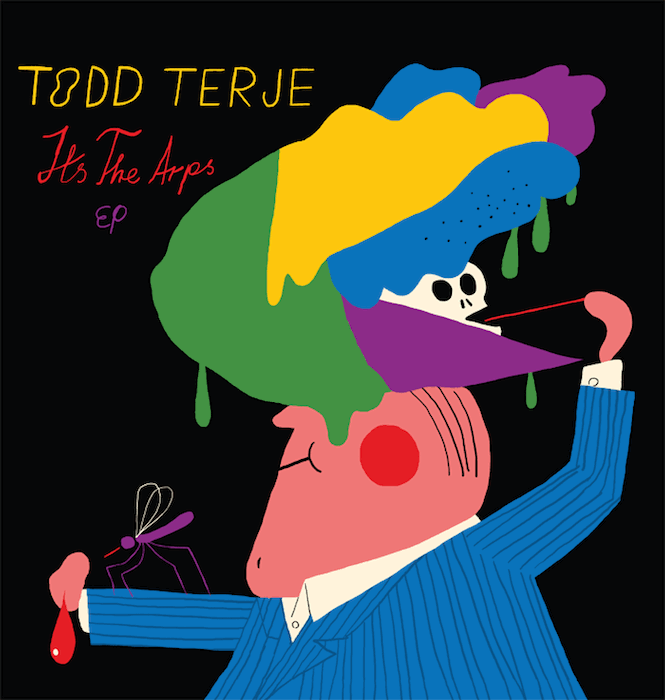
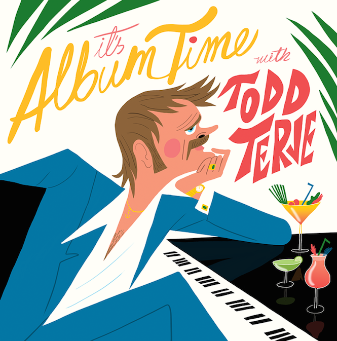
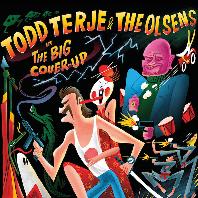
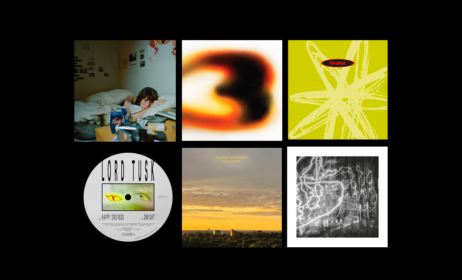
The partnership has been responsible for everything from the sleazy, blue-suited man that adorns It’s Album Time – described by Kaltenborn as “a cheesy self portrait à la Marcos Valle covers” – to the spidery, manic figures of ‘Strandbar’. There’s also, of course, the ‘It’s The Arps’ pinstriped suit, who appears under a precarious deluge of what could either be melting goo or ice cream; the gleeful propeller-hatted star of Terje’s 2015 ‘Greatest Edits’ EP; and most recently, an action-packed collection of gun-bearing characters on ‘The Big Cover-Up’.
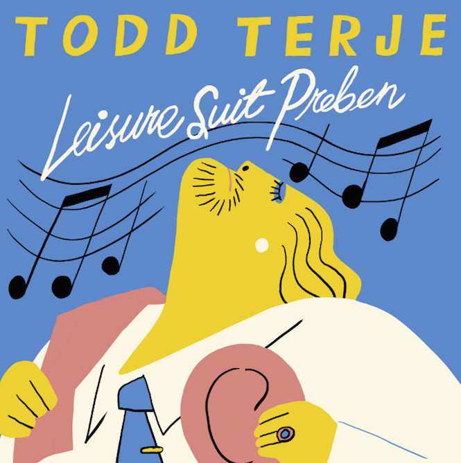
“There’s been no plan of establishing certain characters for Terje, they’ve just popped up… and some guys have been more eager than others to keep appearing in the Todd Terje universe, like Leisure Suit Preben,” says the illustrator.
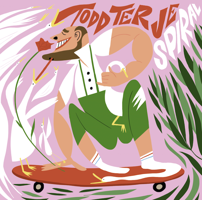
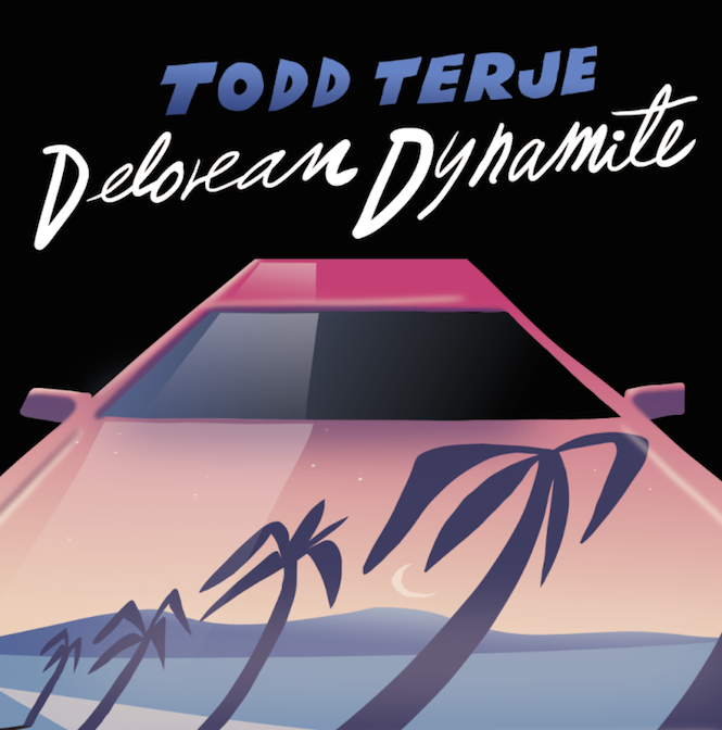
The collaboration has also given the artist a chance to revisit earlier work, with the “skateboarding Tyrol guy” from the Spiral cover an updated version of a duck drawn by the artist more than a decade ago. Even sleeves that forego Kaltenborn’s love of character are clearly stamped as his own, with the pink sports car and reflective palm trees of Delorean Dynamite oozing Miami sleaze.
Another key part of Kaltenborn’s style is his use of hand-lettering, which the illustrator modestly claims comes more from a fear of using ‘real’ fonts than anything else.
“There’s so many rules attached to it, with spacing and curling and what not,” he says. “I leave that to those who’ve read the manual so to speak. When working with hand-drawn letters you can’t really make mistakes, and if someone says you have, you can just claim it’s charm.”
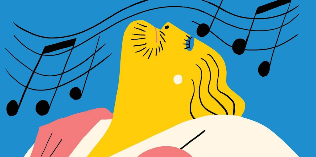
Lettering merges with Kaltenborn’s illustrative style to form a seamless part of Terje’s sleeves. The artist’s purposefully uneven, angular caps are often used to mark out the musician’s name, while his loopy penmanship is deployed for the titles of releases, forming a graphic language that’s now familiar across Terje’s records. The partnership between the two has also introduced the illustrator to new territory, giving him the chance bring his characters to life in the form of an animation for the musician’s ‘Alfonso Muskedunder’ track.
It turns out that Terje had originally planned to partner with a Norwegian comics collective to work with a different artist or illustrator for each release. However the collaboration with Kaltenborn proved a clear and natural fit, and although the illustrator says he never planned to make a specific style for the musician, it’s become a “sort of visual profile”. The joyous ridiculousness of Kaltenborn’s imagery has indeed become a graphic marker for Terje’s records, but perhaps more importantly has established itself as a welcome antidote to the wide-spaced type and serious photography that have become de rigeur. Both Terje and Kaltenborn have shown no hesitation in rejecting this kind of static imagery in favour of something much more interesting, and agreeably manic.
The partnership between the two also comes at a time when illustration is experiencing a resurgence in popularity, even finding itself a new role as a commentator and commemorator of current affairs – such as Jean Jullien’s ‘Peace for Paris’ symbol. However Kaltenborn believes this is part of a perpetual cycle that sees the medium wax and wane in popularity, and mostly attributes the success of his sleeves to a good old-fashioned tactility that’s very specific to vinyl.
“It’s a good way of making people want to own a physical album, and unlike the dull CD format the 12” is beautiful – big enough to let the artwork and design breathe,” he says.
Sign up to our weekly newsletter
Never miss a thing
